
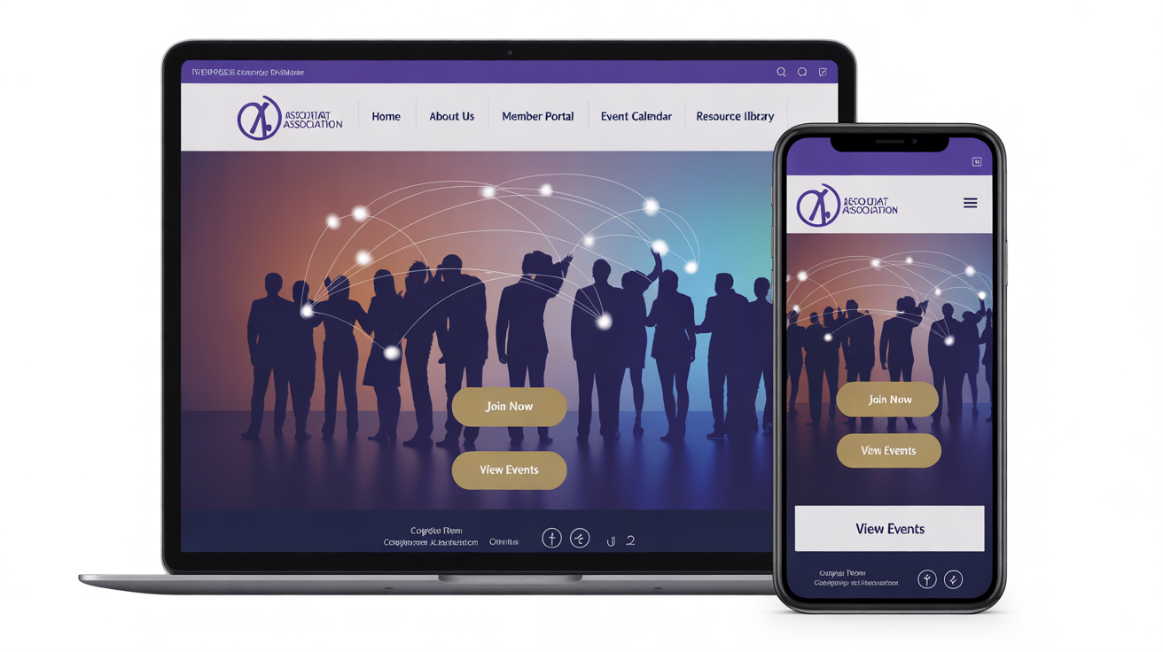
Website Design for Associations: Make Your Site Actually Work for Members
Let's be honest - most association websites are digital disasters. They're organized like internal org charts, stuffed with outdated committee reports, and impossible to navigate on a phone. Members visit once during onboarding, then never return.
But here's what I've learned working with association leaders: when you fix your website to actually serve member needs, everything else gets easier. Member engagement goes up. Renewal rates improve. Your staff spends less time answering the same questions over and over.
The secret isn't fancy design or expensive features. It's building a site that members actually want to use.
Why Association Websites Are Different (And Why That Matters)
Your website isn't like a regular business site. You're not just trying to sell something - you're trying to:
Convince prospects to join
Help current members get value from their dues
Reduce staff workload with self-service options
Build community among members
Manage events and registrations
Show transparency to satisfy governance requirements
That's a lot of jobs for one website. No wonder most associations struggle.
The good news? Once you understand these unique challenges, you can design around them instead of fighting them.
The 5 Website Features That Actually Matter
Forget the bells and whistles. Focus on these core features that deliver real value:
1. A Member Portal That People Actually Use
Your member portal shouldn't be where content goes to die. Make it the most valuable part of your site.
What works:
Simple login that people can actually remember
Personalized dashboard showing relevant content
Easy profile updates (reduce your admin work)
Member directory with useful search filters
Quick access to the benefits they care about
Quick win: Survey members about what they most want to access online. Build that first, ignore everything else.
Our web designer always says: "If members have to hunt for their benefits, they'll forget they have them."
2. Resources That Are Easy to Find and Use
Stop burying valuable content in maze-like navigation. Make it discoverable.
What works:
Search that actually returns useful results
Content organized by member needs, not your internal structure
Mix of free and member-only resources to show value
Clear labeling - "For New Members," "Advanced Topics," etc.
Mobile-friendly viewing for on-the-go access
Quick win: Look at your website analytics. What are people actually searching for? Make those resources easier to find.
3. Event Management That Doesn't Frustrate Everyone
Your event system should make registrations easier, not harder.
What works:
Calendar that shows events clearly
Simple registration with member pricing built-in
Mobile-friendly forms (people register on phones)
Automatic confirmation emails
Easy access to event materials afterward
Quick win: Test your event registration process on a phone. If it's painful, fix it.
4. Mobile Experience That Actually Functions
Over 60% of your members are browsing on phones. Stop treating mobile like an afterthought.
What works:
Navigation that works with thumbs, not mouse cursors
Readable text without zooming
Forms that don't make people want to throw their phone
Fast loading (3 seconds max)
Touch-friendly buttons and links
Quick win: Pull up your website on your phone right now. Can you easily find member login and upcoming events? If not, that's your starting point.
5. Clear Paths to Join and Renew
Make it obvious how to become a member and why someone should.
What works:
Prominent "Join" buttons that stand out
Clear benefit descriptions (not just feature lists)
Simple renewal process for existing members
Pricing that makes sense at a glance
Member testimonials that feel real
Quick win: Ask three non-members to find your membership information. Time how long it takes. If it's more than 30 seconds, simplify.
Choosing the Right Platform (Without Going Crazy)

All-in-One Association Platforms:
Wild Apricot: Good for small-medium associations, handles membership + website
MemberClicks: Better for content-heavy organizations
YourMembership: Works for associations wanting community features
Pros: Everything talks to each other, simpler to manage Cons: Less design flexibility, can be pricey
Traditional Website Platforms:
WordPress: Most flexible, tons of association-specific plugins
Squarespace: Easier to use, looks good out of the box
Wix: Drag-and-drop simple, growing member features
Pros: More design control, often cheaper Cons: Need separate membership management system
Which to choose: If you want simple and integrated, go all-in-one. If you want design control and have technical help, go traditional platform.
Common Website Mistakes That Kill Member Engagement
Organizing by your org chart: Members don't care about your committee structure. They care about solving their problems.
Hiding the good stuff: If your best resources require five clicks to find, people won't find them.
Forgetting about mobile: If your site doesn't work on phones, you're missing 60%+ of your traffic.
Making everything member-only: Some valuable content should be public to attract prospects.
Never updating content: Outdated information makes your whole organization look inactive.
Complicated login: If members can't remember how to access their benefits, they'll stop trying.
Getting Started: Your Website Improvement Plan
This month:
Test your site on mobile and fix the biggest problems
Survey members about what they most want to access online
Check your analytics to see what people actually search for
Next quarter:
Simplify your navigation to focus on member needs
Create clear paths to membership benefits
Set up basic member portal functionality
This year:
Evaluate if your current platform serves your needs
Implement self-service options that reduce staff workload
Create a simple content governance plan
When to DIY vs. Get Professional Help
Handle yourself:
Content updates and basic maintenance
Simple navigation improvements
Member feedback collection and analysis
Get help:
Major platform migrations or redesigns
Complex integrations with membership databases
Mobile optimization if you're not technical
When your staff is spending too much time on website issues
My team works with associations because we understand that your website isn't just marketing - it's a member service tool that affects retention, engagement, and your staff's sanity. We know the difference between features that sound impressive and features that actually get used.
Want to talk about what a realistic website improvement plan would look like for your association? Let's have a conversation about your specific challenges. I'll be honest about what you can tackle yourself and where professional help makes sense.
The Bottom Line
Your association website should make members' lives easier, not harder. It should help staff be more efficient, not create more work. And it should make joining and staying engaged obvious, not confusing.
Start with one thing: make your site work properly on mobile devices. Then focus on the features your members actually use. Everything else can wait.
Remember, a simple site that works is infinitely better than a fancy site that frustrates everyone who tries to use it.
Ready to build a website that actually serves your members? Check out our other association resources:
Digital Marketing for Associations